Compete-HR Web Design
Role(s): UI/UX Designer
Tools: Lottie, Illustrator, After Effects, Pen and Paper, Adobe XD
Devices: Computer, Tablet, Phone
Project type: UI-Design
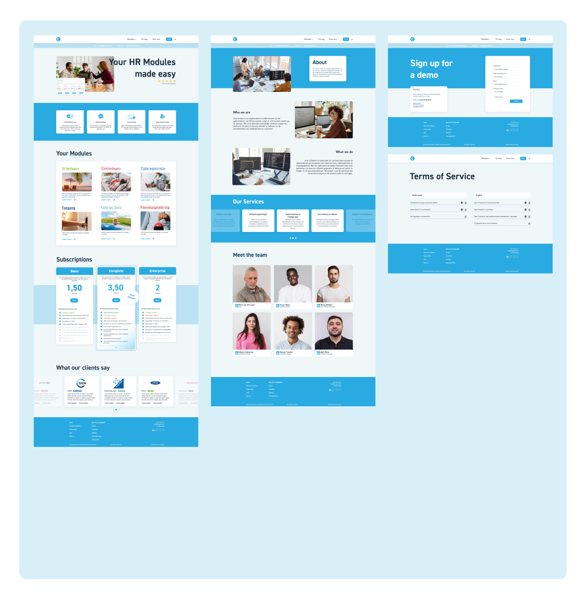
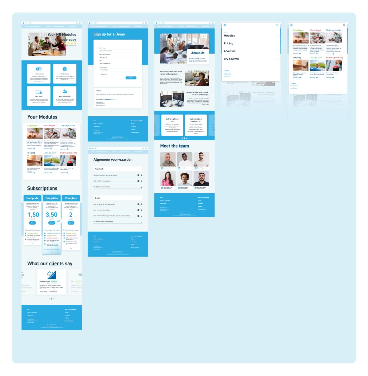
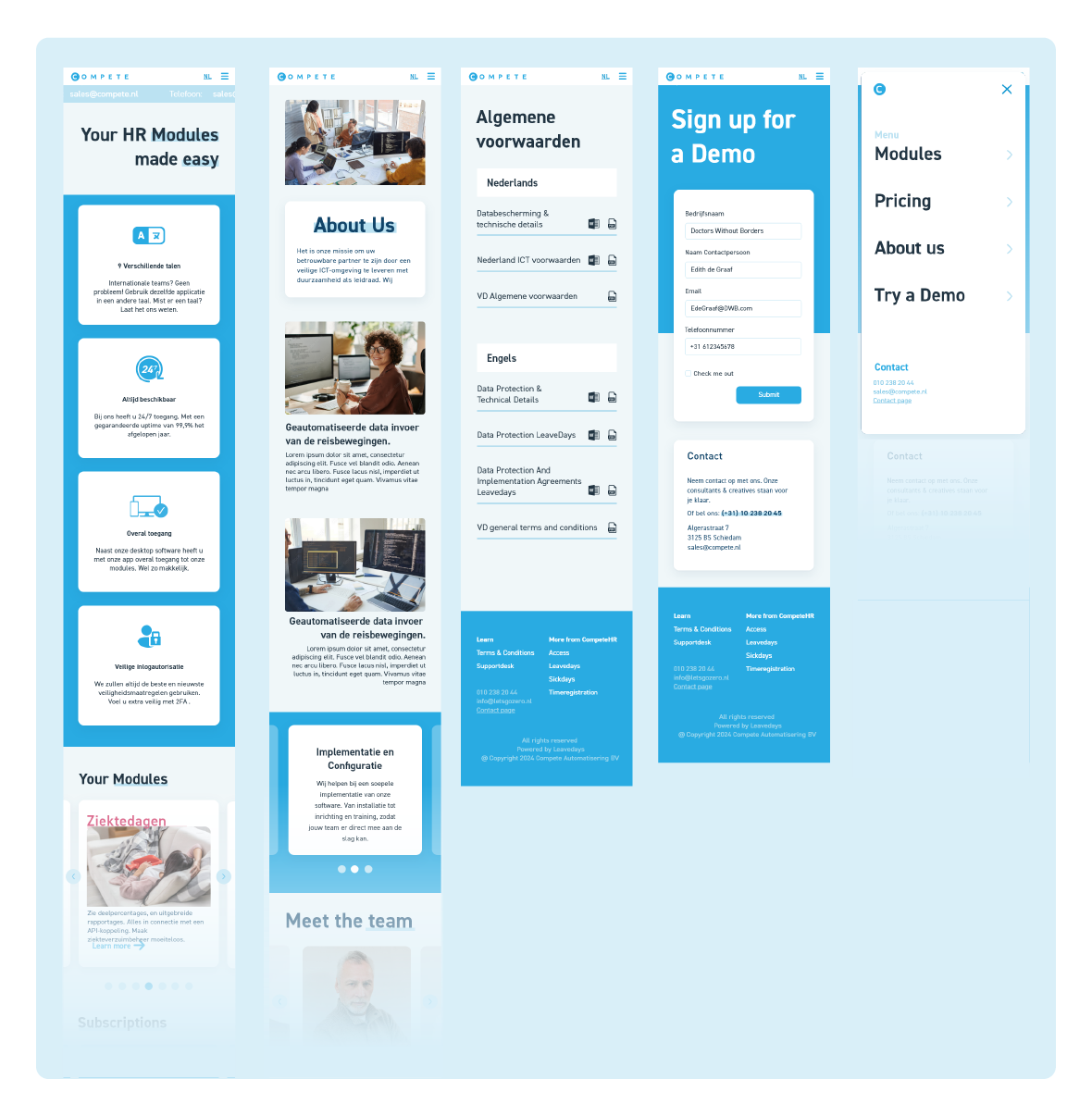
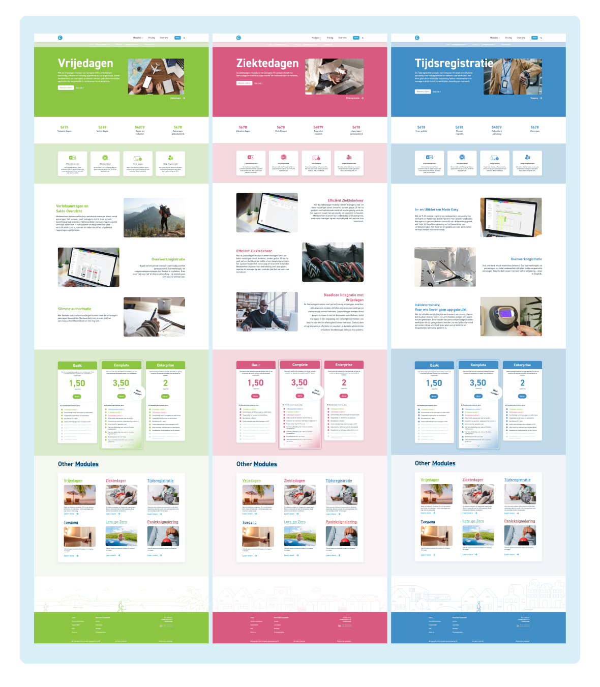
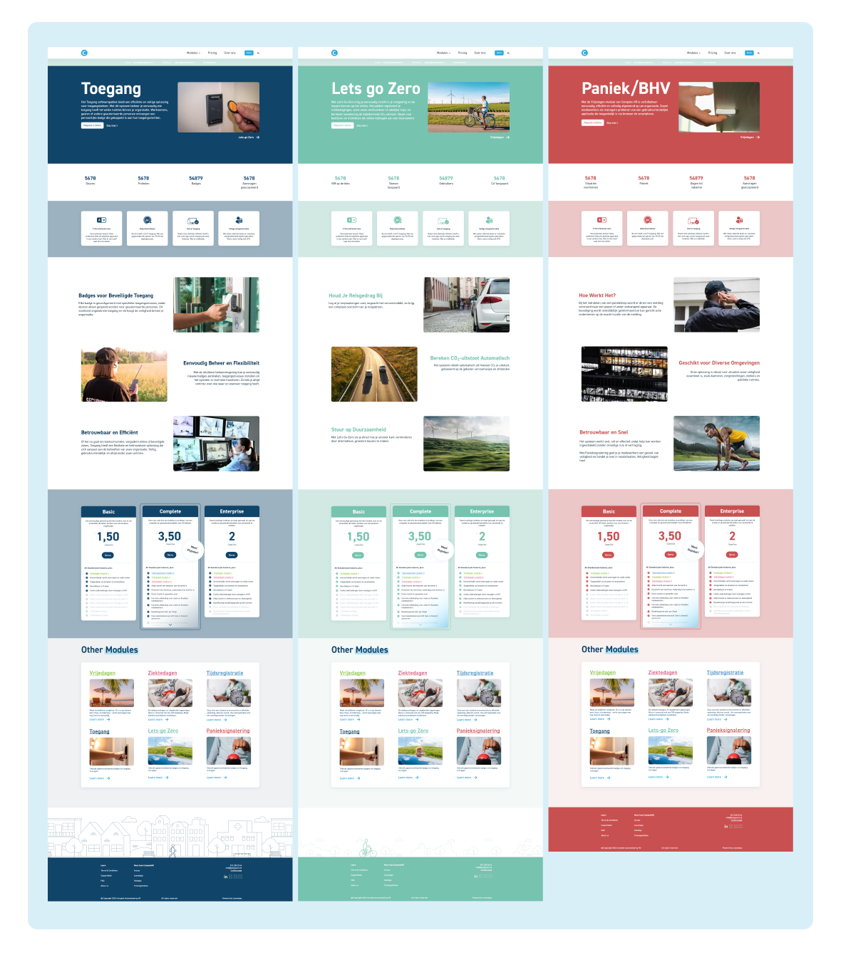
For the rebranding of Compete HR, we created a completely new website that aligns more with the new branding within their applications. The text was completely overhauled, removing repetitive information and giving each module a separate page.
1. Intro
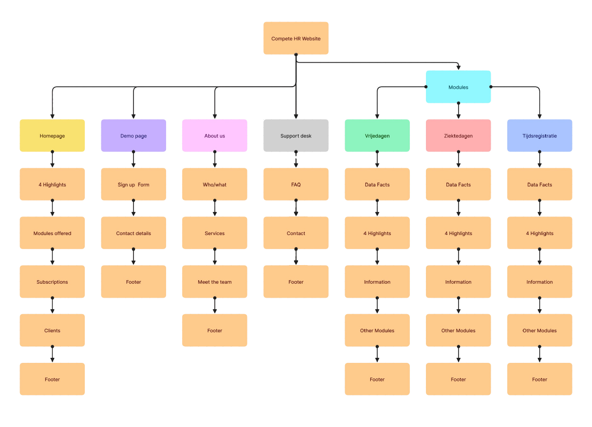
I analysed the previous situation and compared it by creating a competitive audit. From there on I created
a site map to lay out all elements.
2. Typography

3. Colour
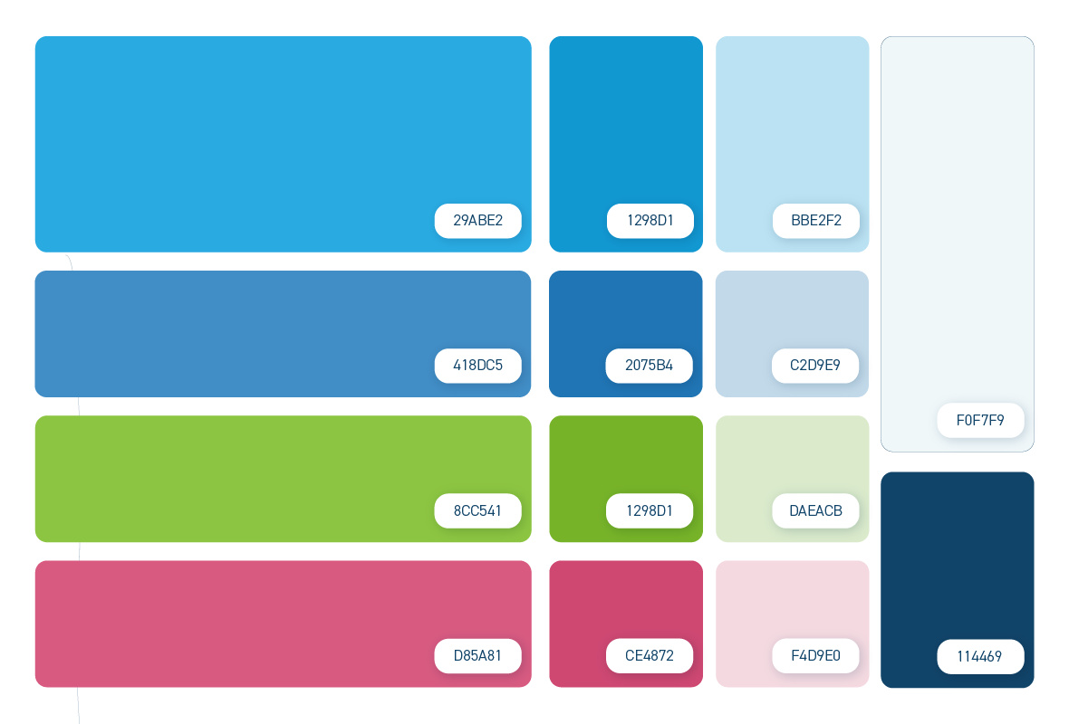
Blue is the main colour of Compete, but we made sure to impliment the colours of the three modules (Time registration, Leavedays, Sickdays) to create a recognisable colour scheme wherever you are.
4. Wireframes
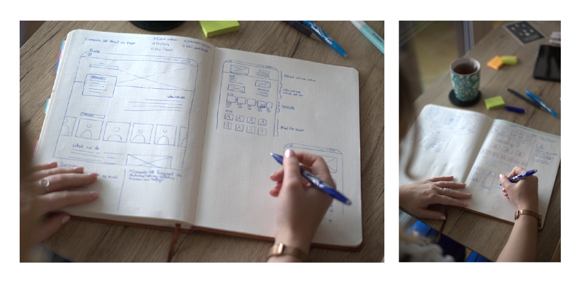
I like picking up my trusty erasable pens and sketching things on paper. Does it give me an excuse to buy new stationery? Sure, but that's not the point. I like to get away from the screen and work things out this way. Wireframing is one of my favourite steps. I especially
liked working out the module showcase in the navbar.
5. High Fid Browser / Tablet / Mobile
Selected Works
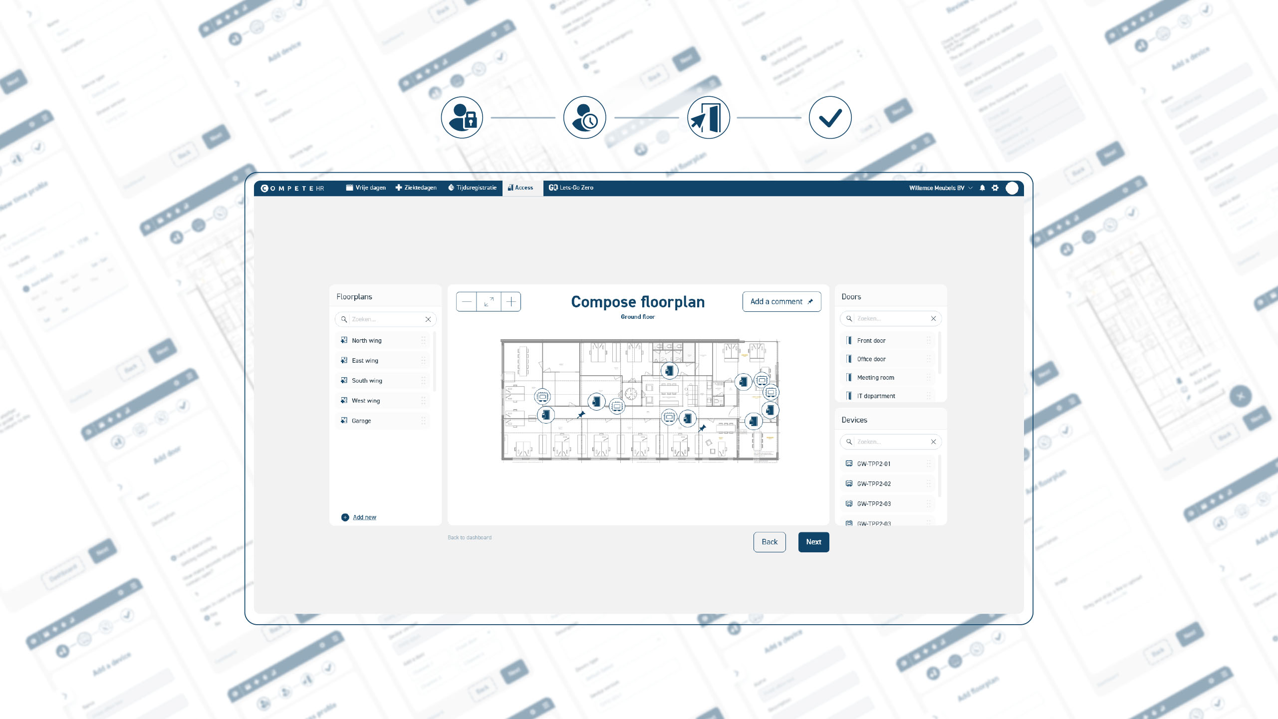
Access Wizard🎯 UI/UX Design

Docubird🎞️ Animated 2D Explainer video
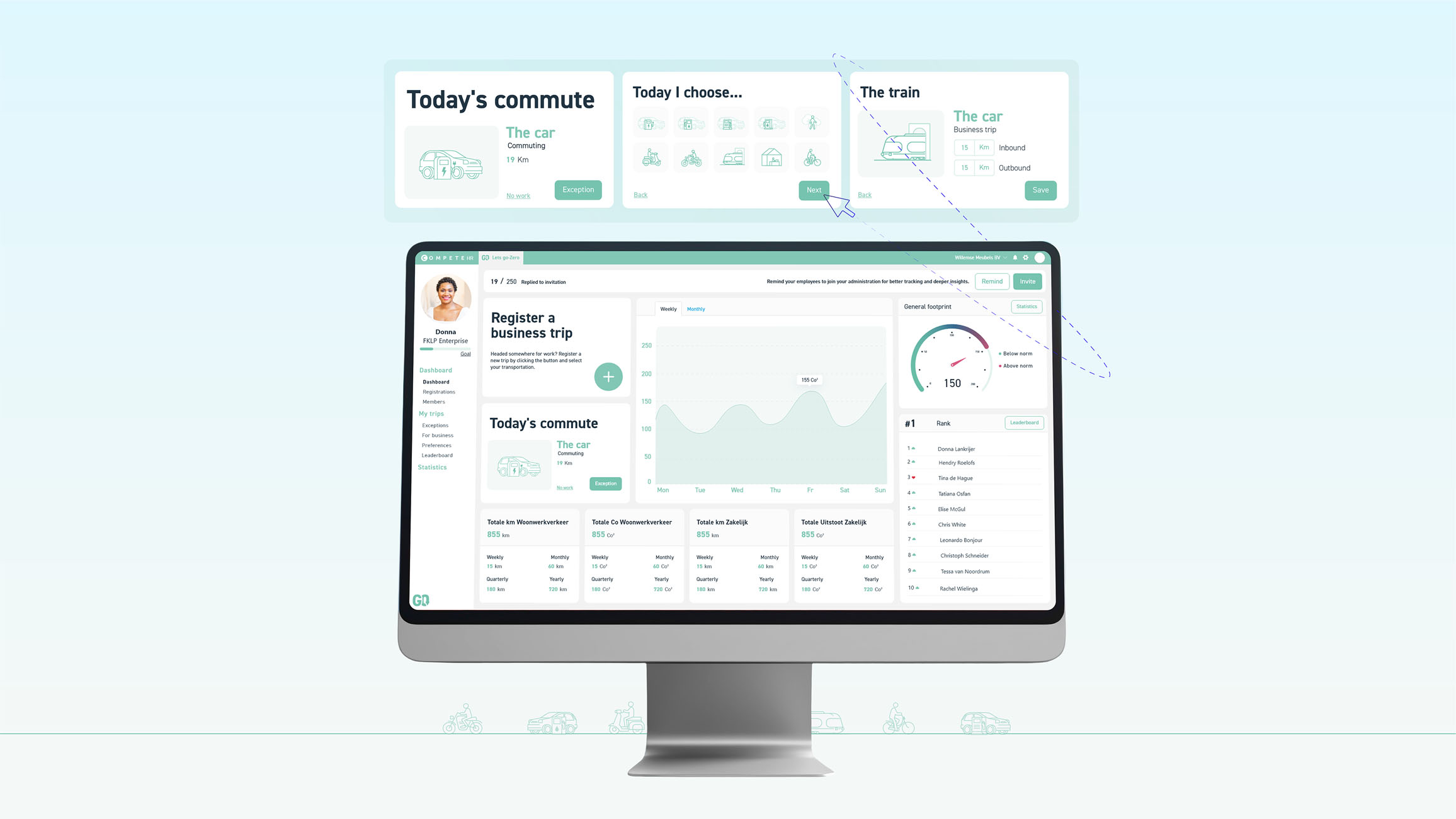
LGZ Dashboard🎯 UI/UX Design

COEO🖼️ Illustration for Explainer Video
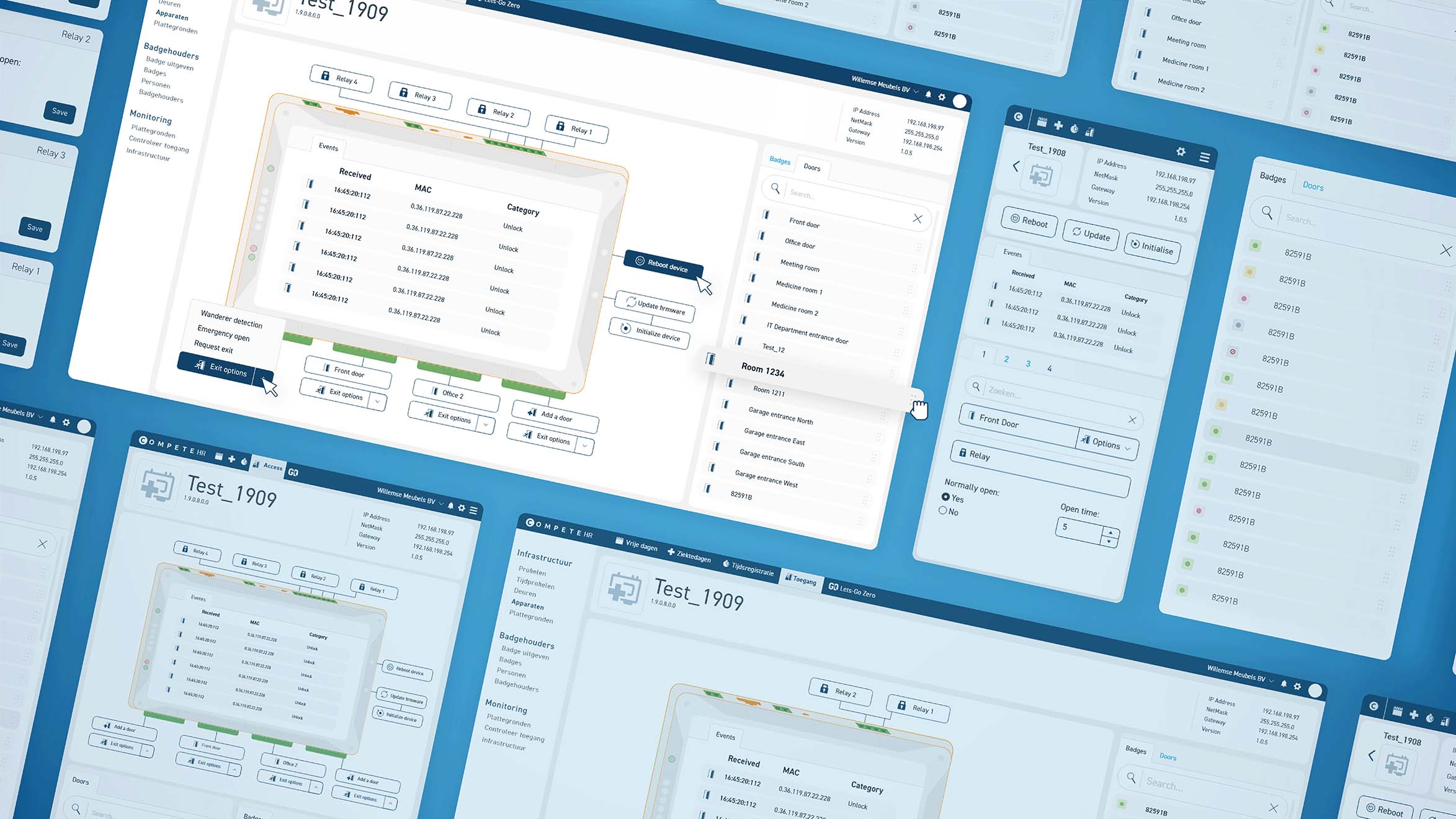
Device Details🎯 UI/UX Design
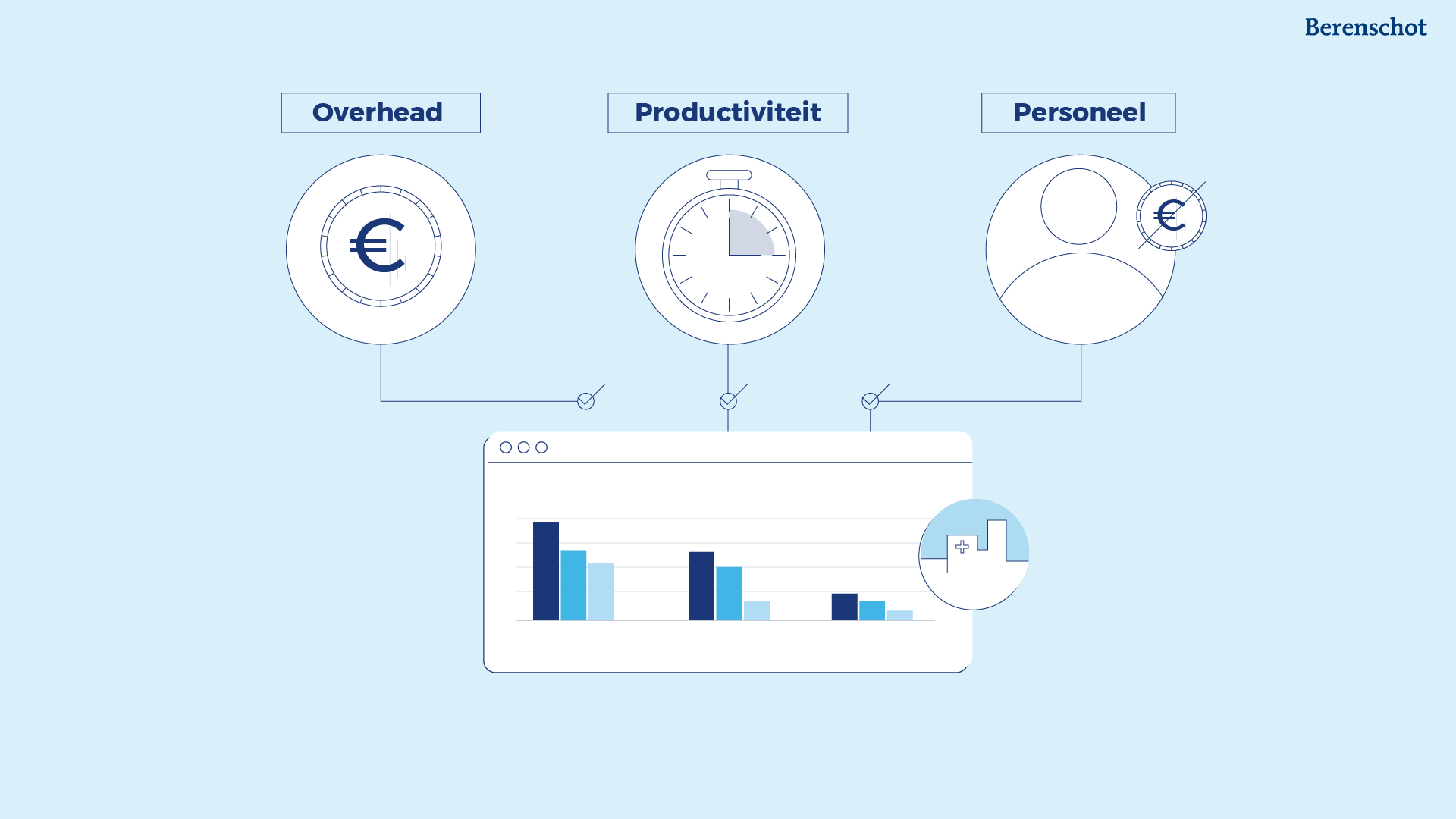
Benchmark CareIllustration for Explainer Video
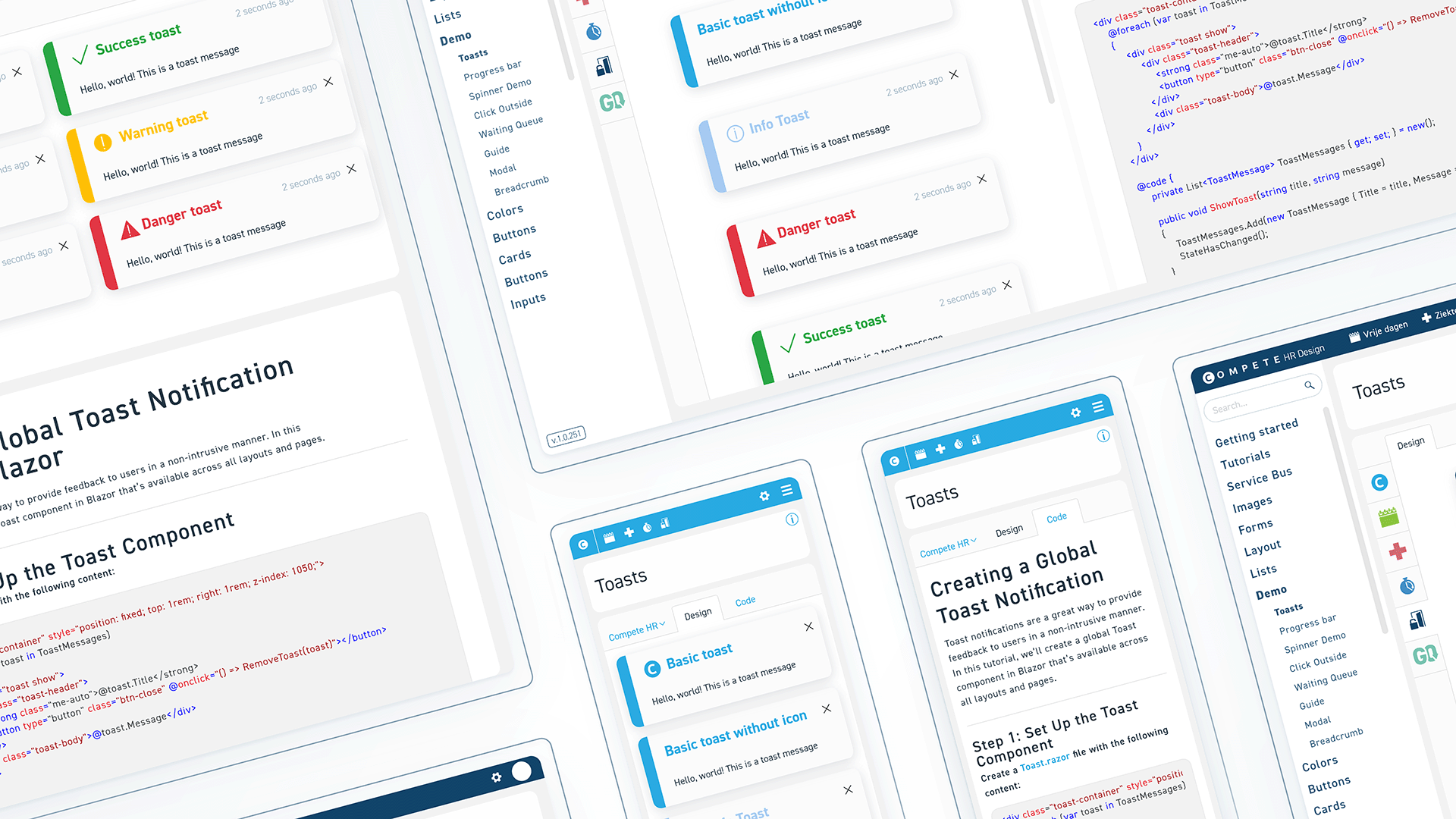
Design System🎯 UI/UX Design

Kiwa GoalsPoster

AAN🖼️ Illustration for Explainer Video
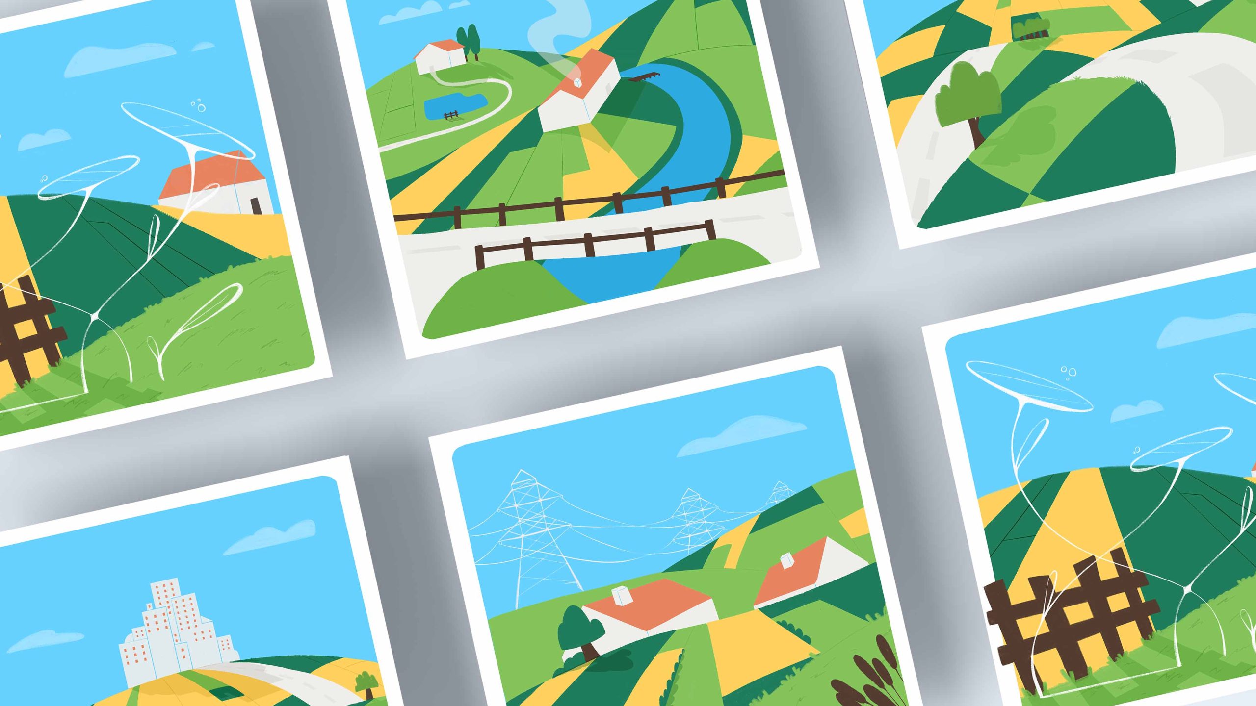
Austria LandscapesIllustrations
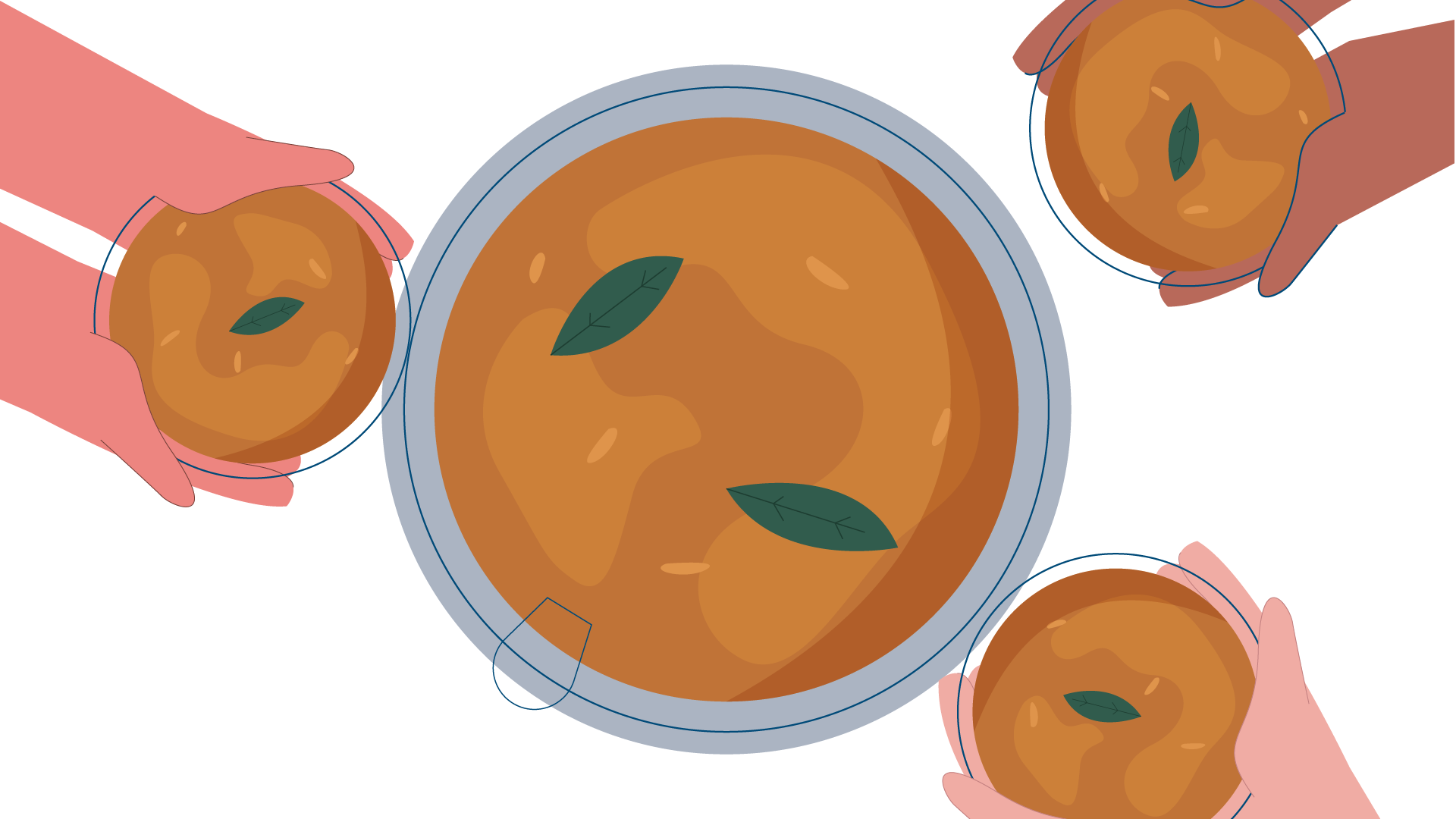
Dignita🖼️ Illustration for Explainer Video

KarterStory board
ContractChainIllustration for Explainer Video

IMR AbbottIllustration for Explainer Video
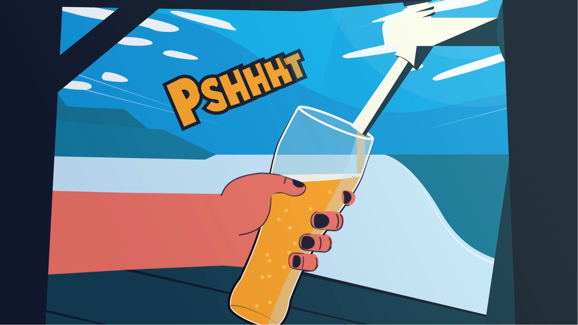
Good VibrationsAnimated 2D Explainer video

ZoetermeerAnimated 2D Explainer video

LinkedInBannerIllustration
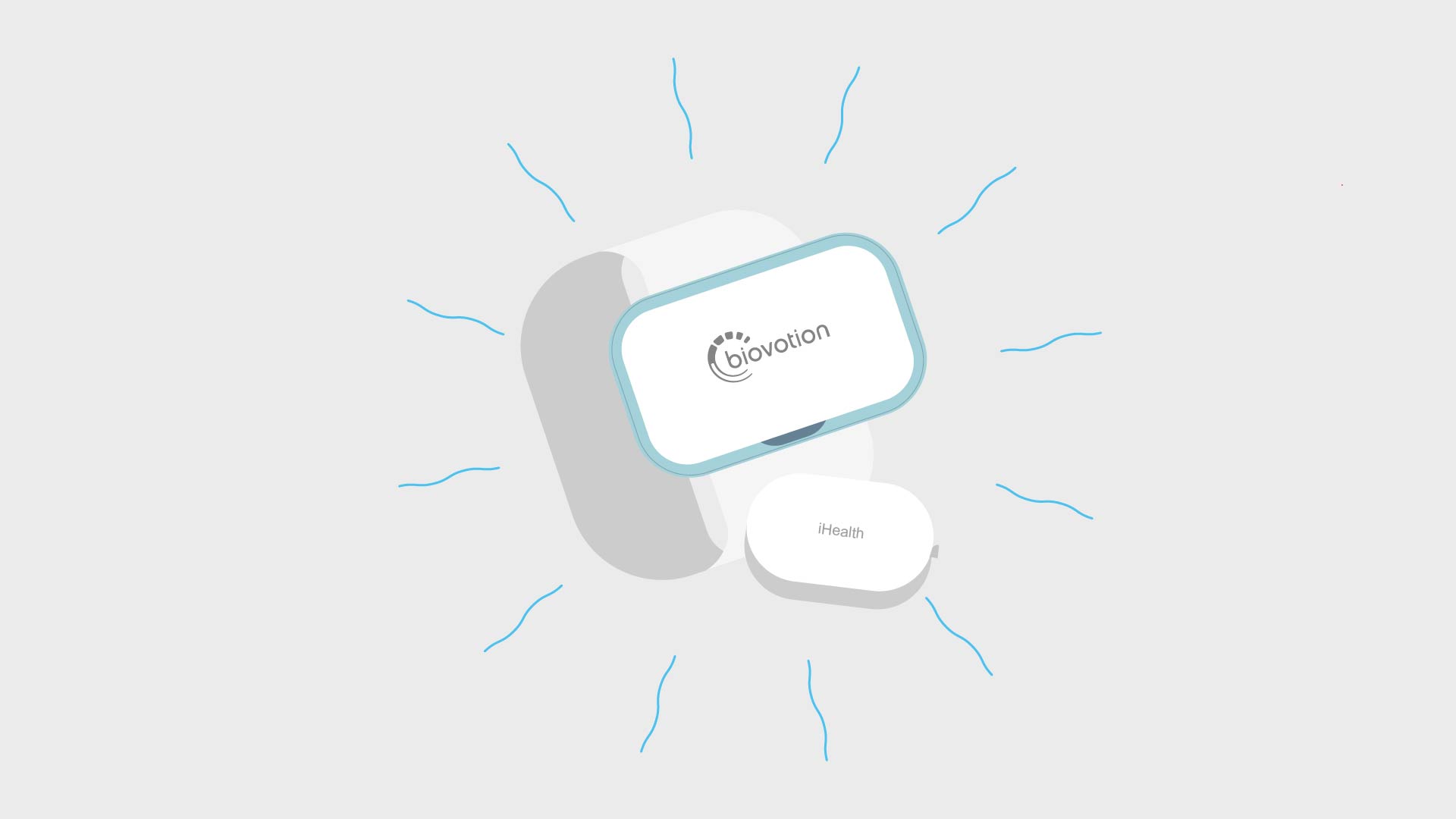
Continue MonitoringIllustration for Explainer Video
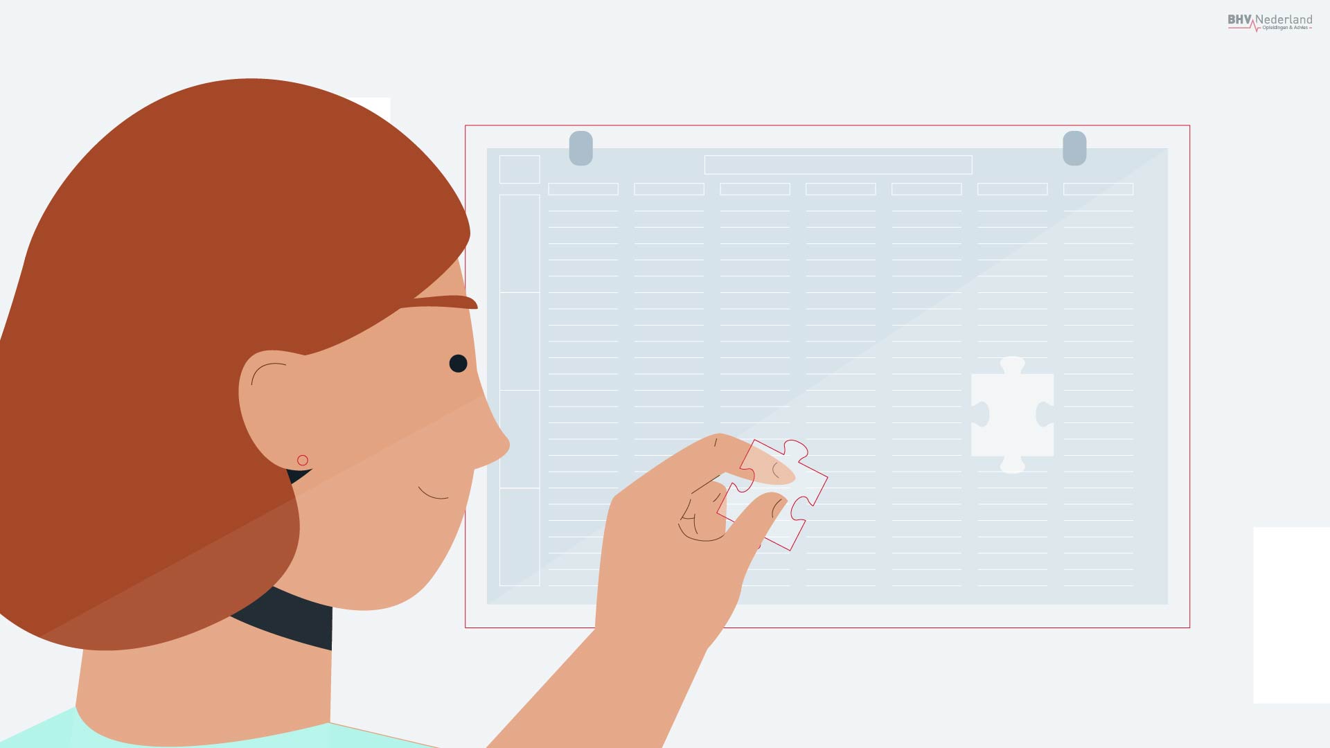
BHV VaardigAnimated 2D Explainer video
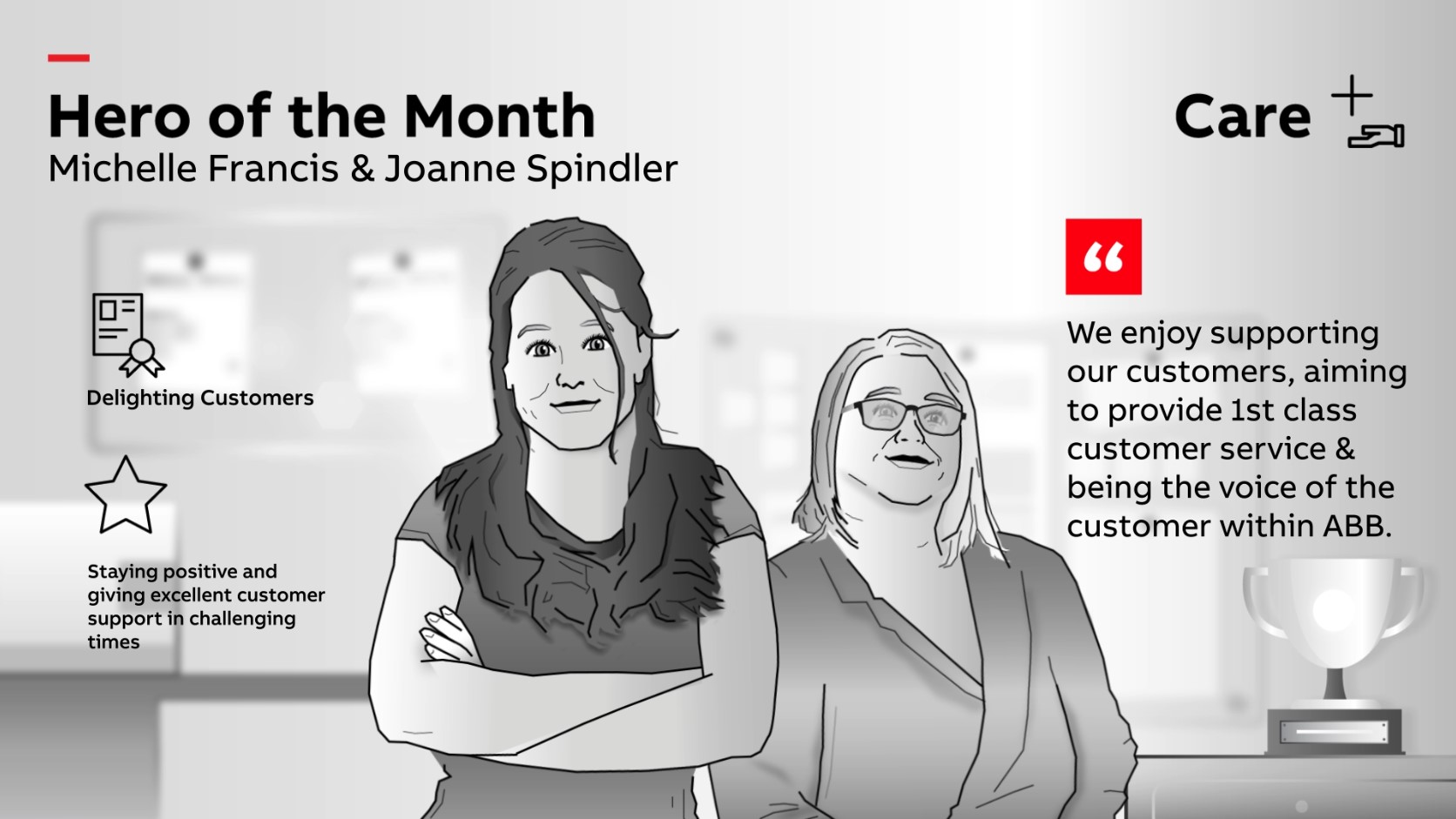
ABB Hero of the MonthAnimation
Privacy Statement | Terms of Service
Copyright and all rights reserved 2024
Website built with Semplice
